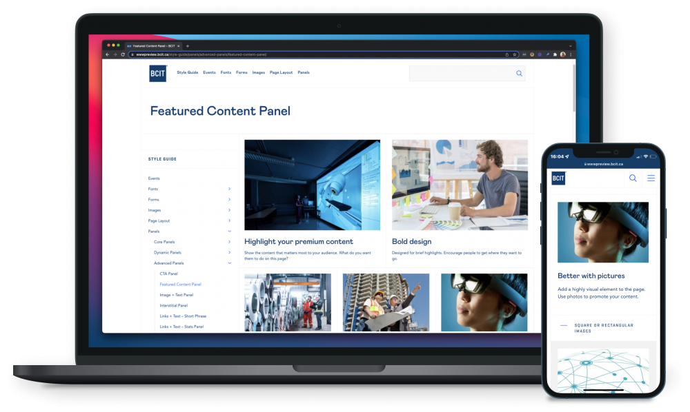
Featured content
Creating a stand-out online experience that any user can build.
Vancouver-based British Columbia Institute of Technology (BCIT) had a new website style but very few reusable patterns that looked good on all screens and devices. We created a flexible off-the-shelf layout to help users create effective content.
Creating a stand-out online experience that any user can build.
Industry
Education
Tools
Sketch, Figma, Miro, Jira
My role
UX Designer, UX Writer, Product Manager
My role
I was part of the website project team building out the content management system (CMS) and was responsible for the experience strategy and design of the CMS, as well as providing advice to users building out content on the published site. I lead the UX work, producing deliverables for specific stages in the project: improvements to the content layout options for users to build their content in the CMS. I worked alongside 2 content strategists, an SEO analyst, a user trainer, and a team of 6 front- and back-end developers.
challenge
Producing effective content at scale
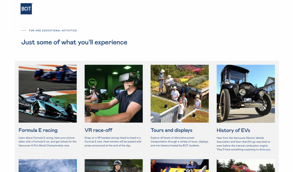
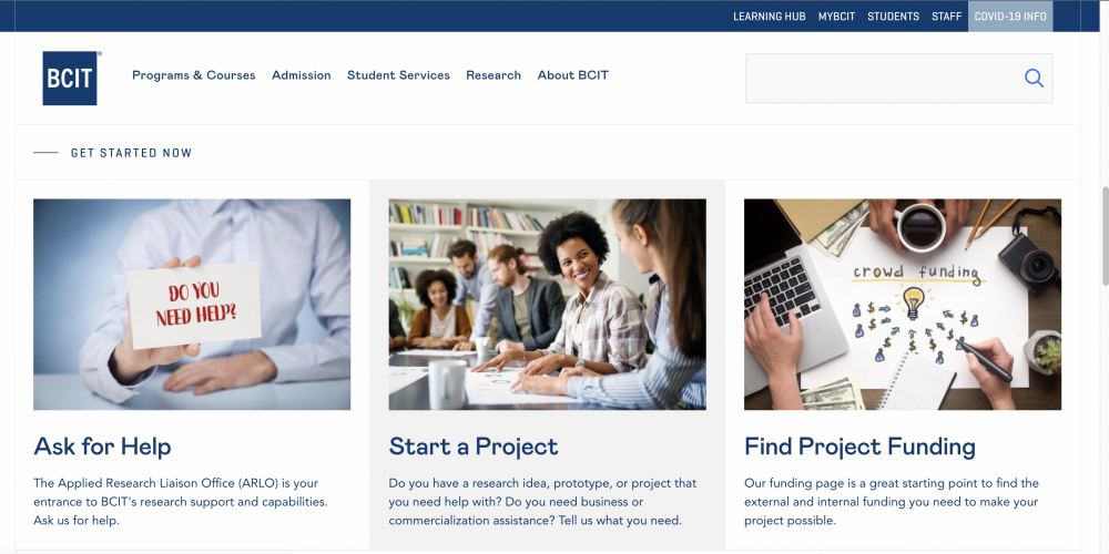
Our users had been trained in the new system and were producing new content to update their website pages. With over 200 users and more than 3,000 pages, there is a lot of content to update, revise and keep fresh for potential students to find the information they need to enrol in a study programme.
While we had launched the main components of the website with a basic style guide and documentation, our users still needed a lot of help in developing pages that ‘looked good’.
In a survey and follow-up workshops we sought to understand how well the new CMS was meeting users’ needs and what gaps there were in their ability to produce effective web content. I acted as the workshop facilitator for the workshop sessions (online using Miro). These activities revealed the system as functional and reliable, but we could make it more convenient and easier to use.
approach
Focusing on features goals
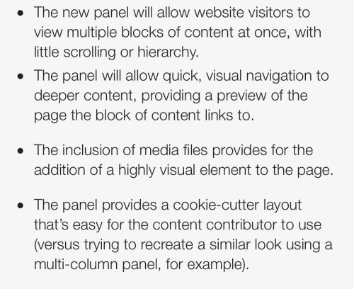
Although the CMS users were requesting a feature improvement, we focused on identifying the goals that puts the end user experience first: the experience of the person navigating and looking for information on the website. That meant articulating specific use cases: what problem does this solve?
Need statement
“As a content publisher, I want to display small groups of content in a visual and non-hierarchical manner so that website visitors can quickly navigate to see user info”not the end-user“As a multi-tasking, tech-savvy website visitor, I want to quickly and confidently compare similar groups of content so that I can easily get to what I’m looking for without having to hunt for it.”
The need statement focused on the end user’s priorities, rather than the CMS user’s priorities.
The team adopted a lean approach, which prioritised the use of wireframes, design mockups, and rapid prototyping for user feedback. As a team, we had frequent regrouping on ideas and the direction of the design which kept us aligned to the original use cases and need statement.
Research and discovery
We used personas, analytics review, and competitor research as part of the discovery process. The personas helped guide our design decisions and priorities, and helped in the development of specific user scenarios.
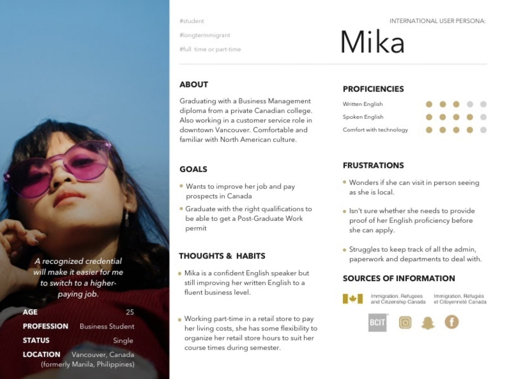
We used each persona to generate “I want to” statements linked to their goals.
“I want to find the info I need about the courses I can apply for without having to read large chunks of text.”
“I want to find a course at the right level for my language skills.”
“I want to improve my skills and still hold down my job.”
Mika wants to find out info for an appropriate course without having to spend hours searching the site.
Requirements
Armed with the information from the discovery process, we worked on developing technical requirements.
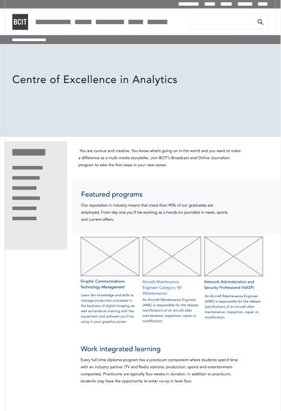
We used rough wireframes along with the requirements to advance the design. I also presented a rough wire of how the content would look on an existing page template so that we could see any immediate issues with style or spacing.
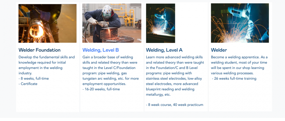
In the research phase, we’d noted that for the best flexibility the content should allow for up to 4 content items on a wider desktop device. 50% of site visitors to key website pages were on mobile — which matched user personas also — and so it was an essential requirement to allow for responsive stacking for scrolling.
Wireframes

Mockups
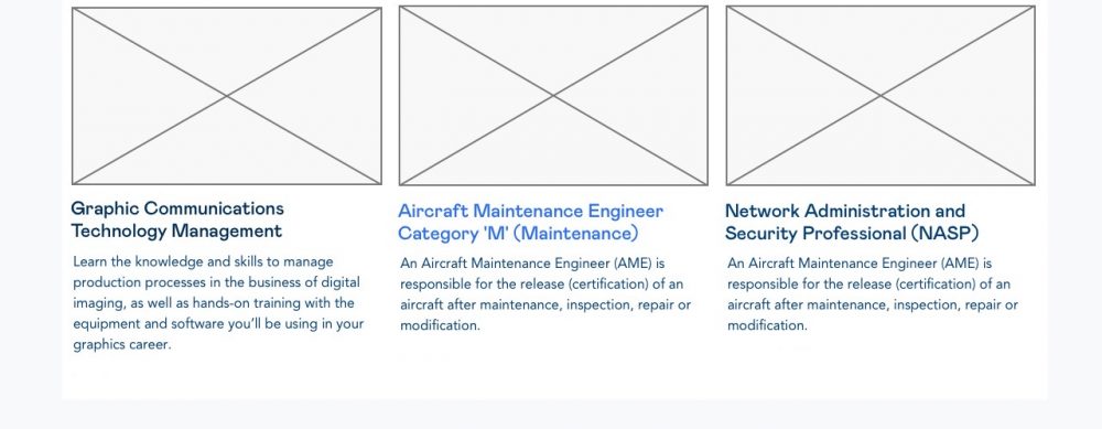
We created mockups to test on actual site content to get user feedback, along with the content strategists, to identify and prevent common user errors. Content creators struggled to find appropriate image sizes and formats so we focused on making that easier.

Back end-user interface
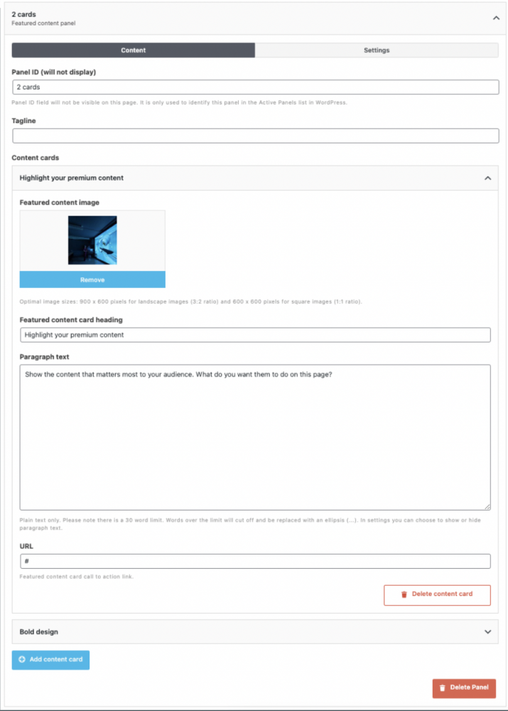
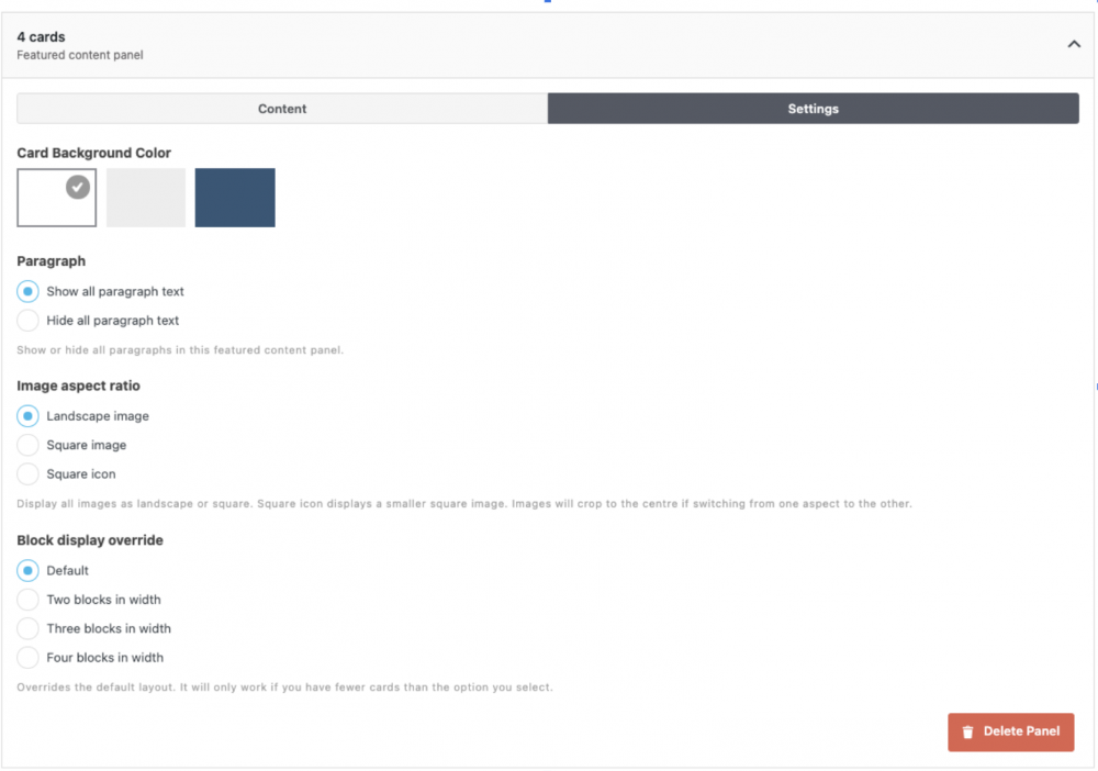
Once we had a decent idea of what the published content would look like, we focused on the back-end interface where users insert actual content. I worked on the wording, subheadings, radio button text and in-page help text.
The NNGroup’s 10 usability heuristics were very useful at this point. We had to ensure the new feature matched the rest of the interface and used familiar language and terminology.
impact
Used on over 100 high profile web pages
The featured content panel received positive feedback from users and it has been used on high traffic pages and campaign pages. Users have responded well to the panel’s flexibility and easy of use. However, there is further guidance needed on how to best implement it as part of an entire page or site—spinning up further UX consultation projects.