
Enhancing the map
Improving the map experience for users on any device or platform.
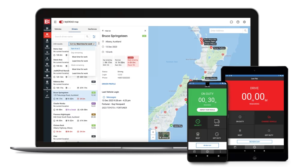
The company has multiple mapping platforms in desperate need of an update to ensure they work well on all screens and devices. We updated the experience across two separate platforms as well as including powerful new features to meet user needs.
Refining designs to focus on time-critical user needs.
Industry
Transport
Tools
Figma, Miro, Jira
My role
UX Designer, UX Researcher
My role
I was part of the project team designing and building the back office experience for fleet managers and was responsible for the research and design of the journey planning tool, as well as refining UI interactions for the map icons, layers and settings. I lead the UX work for one of the two major platforms. I worked alongside 2 other UX designers, a product manager, a product owner, a QA, and a team of 6 front- and back-end developers.
challenge
Unifying two different map experiences
Our users are on two completely separate maps and platforms as a result of the merger of two telematics companies. Both had their pros and cons. The challenge was to identify the key parts of each that provide the most value to users and focus on unifying and integrating them into an updated map experience. This was tied in with a major backend update so we had to be careful to keep the project within the allocated budget and timing.
approach
The devil is in the interactive detail
Part of the challenge was in testing and fine-tuning specific interactions for the multiple layers. I could tap into user behavioural observation and usage metrics as well as individual and group user interviews. These interviews started as discovery workshops and later on involved testing specific prototypes.
I acted as the workshop facilitator for some online workshop and feedback sessions, and worked with the team to develop and test hypotheses for the best pathway forward.
As a design team, we spent a lot of team refining the hover and selection states for icons and layers on the map. This took a lot of time as we identified it as a critical part of ensuring user acceptance and delight in using the updated platform.
Reworking existing functionality
One of the requirements was to identify existing functionality that was present in one of the platforms but not the other. While many features would fit this criteria, we had to make some tough choices on what to focus on first. One feature that came up was the journey planning tool specifically tailored to the user’s truck locations; however, it was very unintuitive in its existing form. I focused on that feature in my research and designs.
impact
Fast adoption of new features… and lots of positive (and some constructive) feedback
We went through an alpha and a beta launch to pick up and iron out any hiccups in the interface and in the design, particularly looking for any functionality that users felt was missing or interactions that felt stilted or strange. There was one specific piece of feedback for the journey planning about allowing multiple options for modifying start and end points. That was prioritised as part of the general release.