
Bike AKL | Website
Research, site architecture & user testing
Bike Auckland is a cycling advocacy group that helps people get around Auckland by bicycle, particularly focused on improving the cycling experience and actively campaigning for better infrastructure. I worked with the website content editor to develop the refreshed website structure. This involved research, user testing, multiple design iterations and collaboration with the dev team.
| My Role | Who Else Was Involved | Tools & Methods Used |
| User Research Data Analysis Persona Development Revise Site Architecture | PM & Content Editor Web Dev Team | Interviews Observations (User Testing) Card Sorting & Tree Testing Data Analysis (Google Analytics) |
Problem
Cycle Action was rebranding to Bike Auckland, and wanted to review and improve their website at the same time. The steering group had poor visibility of what Aucklanders expect from both the organization and the website. The web dev team had prepared a refreshed design, but it hadn’t been tested with any users.
My first task was to define the problem and project scope. I proposed these questions:
Does the website serve the users’ and organization’s needs? What do people expect from the organization? Were the ‘neglected’ sections important? How does the website fit with the social media presence and interaction?
One initial driver for the project was the low engagement on the website (compared to social media). Did the website serve the needs of members and the local cycling community?
Discovery Phases
Data Analysis: Review of current website activity
I set out by looking at how people discover the organization and its website online, using the available analytics data: current website user activity, landing pages, top keywords and search terms both on Google and within the site.
Up until this point the website had primarily been a blog. The content editor had primarily been using the website primarily for publishing blog posts, promoting these heavily via social media. This was reflected in the page visits and interactions. The static areas of the site were neglected with out-of-date information and few visits. Other parts of the website were not responsive to the needs of site visitors, and did not match their in-site search terms.
User Research: Interviews
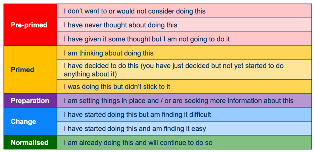
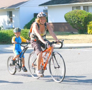
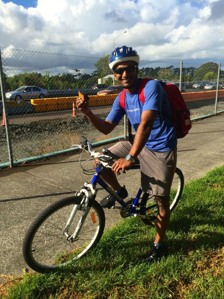
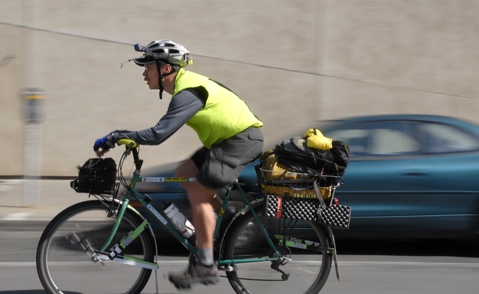
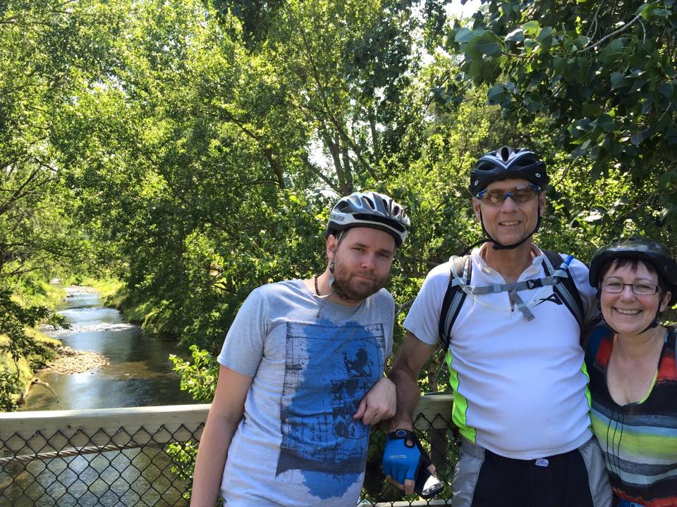
When I approached interviewees, I deliberately aimed for a mix of long-term and new members. This was to both capture a range of ages, both genders, and to increase the likelihood of getting a variety of web user styles. The project budget and timeline limited me to 3-4 interviews, so I needed to be selective! I also narrowed it to people preparing, changing or at the normalized stages of cycling behaviour (see image).
The interviews were free-flowing discussions – I wanted to understand their view of themselves as a bicycle rider, how important cycling was to them – followed by some open-format questions leading to the expectations they had for the organization and what content they expected to find on its website. This prevented me from making assumptions – in fact, most of my interviewees felt uncomfortable labelling themselves a cyclist.
User Research: Behavioural Research
As well as first person interviews, I examined existing research related to behavioural change. The main areas of my research into these categories:
- Interview insights & data analysis (my research)
- Bicycle rider behaviour change stages (international research)
- Recent local research reports (local research)
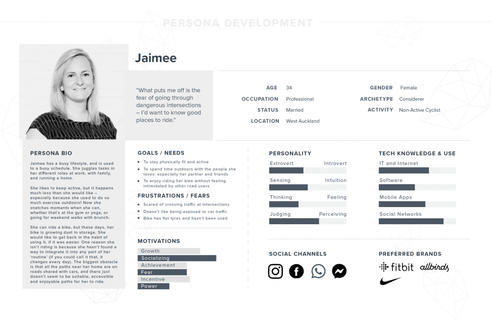
Persona Development
These groups all comprised of Aucklanders with an active interest in riding a bike, both those who are already riding and those who are interested in starting to ride. I created details for each including demographics, home and work locations, riding confidence, frequency, distance and cycling identity.
I used each persona as a reference point for development of the site IA, menu language, and layout. During the iteration phase users were selected from each persona group.
User Research: Observation, card-sorting & tree-testing
I observed how each user searched online for some information related to cycling in Auckland. At this point it would have been helpful to have an assistant – I had to note-take and observe at the same time. I also recorded the sessions for transcribing later, in case I missed something. (I was keen to capture the exact language they used – it helped me to identify particular pain points). I didn’t have a video recording so during the interviews I paid particular attention to non-verbal moments, and encouraged the participants to talk through their thinking as they searched.
Card-sorting helped in prioritizing issues and resources that each participant was interested in. Two of the participants frequently mentioned other users – as in, “I wouldn’t need to look that up, but others might” (e.g. bike routes for children, or bike routes for adults) – so I needed to refocus them back to their specific needs.
I used this project to try out tree-testing – providing them with a site structure, then asking them to find a specific piece of information on the site – with mixed results. One participant found this to be too artificial, as he stated he always used site search. This was interesting as it didn’t match my data analysis (the site search was hardly used). I used it as a discussion point for online search methods.
Tree-testing 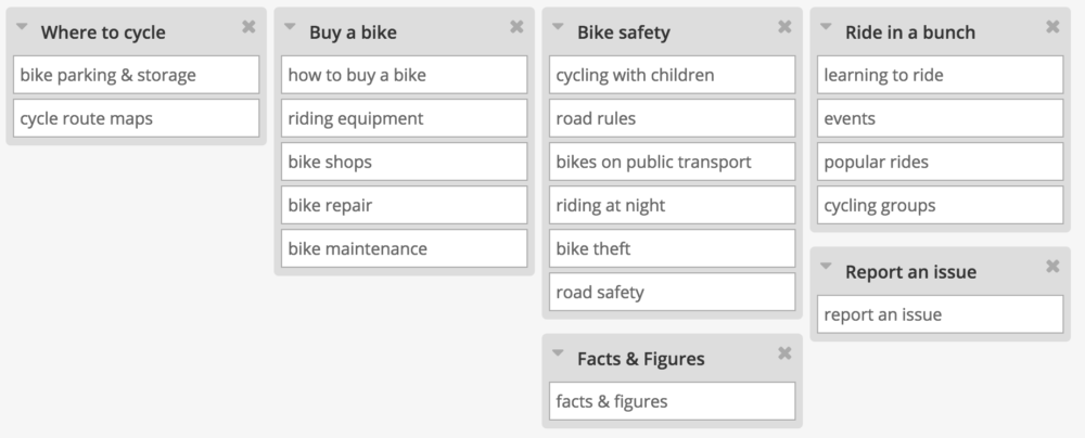
Card-sorting
I discovered that:
- Participants strongly identified with specific reasons for cycling (e.g. commuting).
- Participants tended not to identify as a ‘cyclist’. This may not apply to all user groups (no sports cyclists were interviewed).
- Participants were pleasantly surprised by what information they could find on the website.
- Participants weren’t too worried about website structure, as long as they found relevant information quickly, without going deeper than one or two clicks. Familiar menu icons and placement were an important part of this.
- Participants do not like ambiguity in menu item labels. They want clarity, not cleverness.
- Participants struggled to find an overview of region-specific projects, and did not differentiate between blog posts and static pages.
- Social media is perceived as a useful tool, but not a definitive resource.
- Google search is the most important online tool; it is the first online destination by default, rather than the website itself.
- As a city-specific bike advocacy group, participants expected to find city-specific cycling-friendly routes and maps.
- Participants were highly motivated to learn more about cycling infrastructure projects across Auckland, regardless of channel.
Iterations
Iteration of Top Navigation Menu
Following my user and market research, I started evaluating the site architecture and content, whether it met the identified user needs. From my observation research it was clear the top nav left some gaps in understanding of where to find content, so I focused on modifying some language, trying out different options and testing different ideas. I modified the language of the top navigation menu:
“About” “On Your Bike” “Projects” “Get Involved”
changed to:
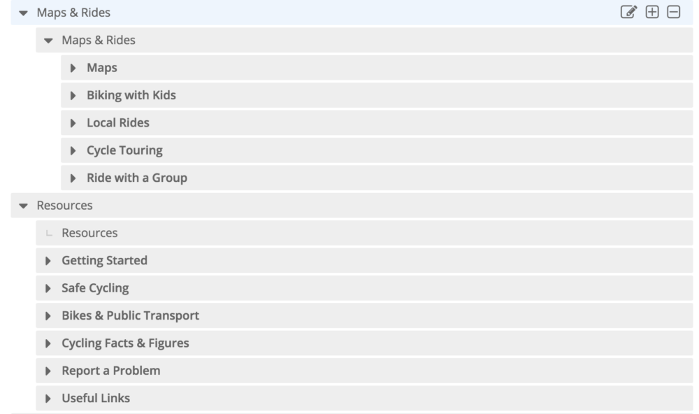
“About” “Projects” “Maps & Rides” “Resources” “Get Involved”

Further user testing revealed that users struggled to differentiate between “Projects” and “Resources”, and did not immediately comprehend what “Projects” referred to. After discussion with the content editor, we decided to modify the “Projects” label to “Progress” to signify infrastructure improvements, while keeping the heading short enough to fit the design constraints.
The lack of a hover for the submenu under “Projects” in the first iteration also meant that users hovered over the menu item and then passed on – in the interviews, this was a major topic of interest for the majority – so we requested that the dev team add in a hover function to reveal submenu items more quickly on desktop.
“On Your Bike” was removed and loosely replaced with “Resources” – this menu item grouped together a seemingly disparate group of pages. We debated longest over this term, as users still found it too vague; however I also realized that these pages represented some of the main items that people reached through a direct Google search, yet are not key activities for the organization. [Edit: this page has since been renamed to Services, as Bike Auckland’s role has evolved over time]
Iteration of Site Structure
We reviewed the categorization of blog posts – I ensured the categories (regions) were applied consistently so that the dev team could create filtered pages of blog posts by region. This was straightforward but essential to a user-friendly experience – otherwise users had to scroll through blog posts or rely on an inconsistent search (we had learned that users don’t use tend to use the site search, preferring to scan through all the menus quickly).
Highlighting Key Content
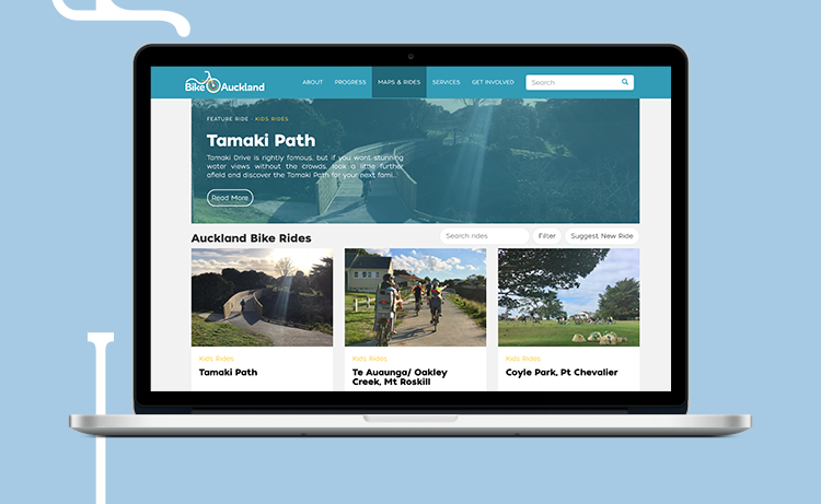
Maps, routes and rides was another addition to the top menu. These far outstripped any other subject as a top landing page for interested site visitors, and as discovered in the interviews and through the persona development, finding pleasant, bike-friendly routes was a key goal. I tested various wordings with users, finally settling on “Maps & Rides” as the most concise yet clear menu label.
Outcome
After implementing the changes, users reported that the site felt cleaner, faster and easier to navigate. The website has had sustained audience growth and a stable bounce rate.
Next steps include comparing the site visitor experience with those who only interact with Bike Auckland on social media posts – to discover whether there is a difference in campaign effectiveness, and whether the static resource pages continue to give users the tools to get out and bike more, and transform Auckland into a bike-friendly city.
???♀️?