
Digital Style Guide
Reference guide for 100s of content creators to create a consistent style and tone of voice on bcit.ca.
The overall project was a major website upgrade and migration to a new digital platform. The goal for the style guide was to create a reference for the overall site design. Its primary purpose is for content editors, publishers and IT admins to have a consistent and up-to-date guide on the available styles and the best way to implement them. It’s also a useful central reference point for both in-house and external design agencies to refer to when developing specific campaign pages or microsites within the BCIT digital ecosystem.
| My Role | Who Else Was Involved | Tools & Methods Used |
| Copywriting Layout & Build | Front-End Devs Content Team | WordPress CMS |
Problem
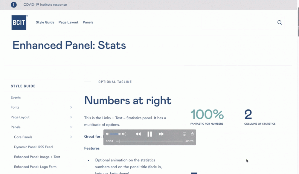
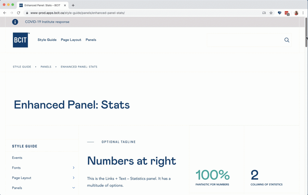
The external design agency had supplied an initial design document which had quickly become outdated — the site design had evolved during the build process. The in-house developers had created many new design panels as the content team identified new requirements to display web content in different ways. The project was moving quickly and there was no master reference point for building out pages, which was slowing down the overall migration progress.
Responsive design baked into the guide
There were already some guidelines about content production on the staff internal communications platform, The Loop. These were based on what had been developed for the previous CMS, and relied on screenshots and written explanations to explain the best practicese for site layout.
One major difference with the new WordPress CMS is its responsive design. Content resizes and formats differently depending on the width of the browser window, and the type of device each site visitor uses to access the website.
Some of my initial questions were for my own understanding of the design. I quickly saw that this information would also be useful for other people planning and building content:
- How do different elements of the page display on different browser sizes?
- How might we demonstrate the responsive design to content publishers?
- How can we easily view and test different layouts?
- How do we share our design guides with external designers?
Solution
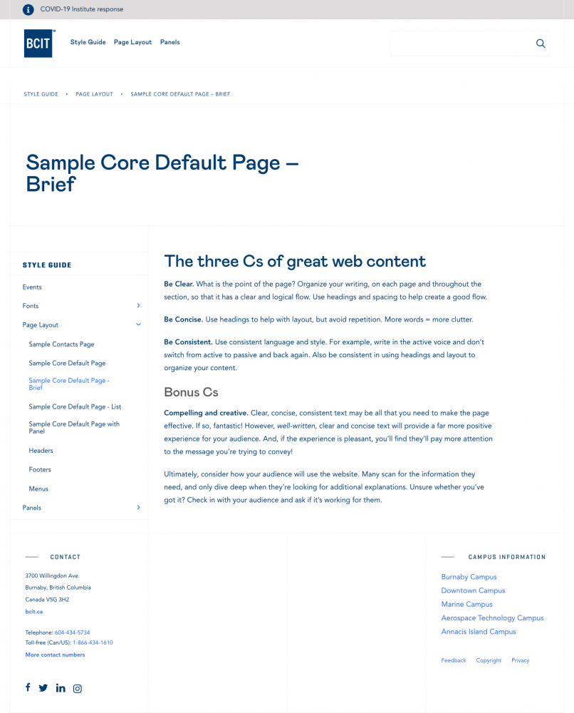
The logical answer was to provide the context in the same CMS interface that houses the website. It is on the live site so that it never falls out of sync with the live site – it uses the same code and you can see the same functionality.

Outcome
The Style Guide is a living project. I update the pages as the team continues to develop new functionality, or as we identify new design patterns that need consistency throughout the site. The design team provide ideas for how to present it so they benefit from it too. There’s still plenty to add!
The next planned step is to integrate it more closely with the user training and support documentattion on the staff internal communications platform, so that we can share it for the wider web content community to refer to and benefit from.